I lead the design for a global launch of Jägermeister’s Ice Cold Shots. I retouched the backgrounds, models and bottles. Their brand assets were refreshed for this campaign giving them a very COOL art-direction and layout.
I designed logos, developed the look & feel, created key visuals, retouched the talent and environments, and rolled out the designs for social.
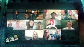
Meister Class is a series dedicated to delivering nightlife to your night in. From cupboard cocktails to learning to scratch, our Meisters show you five hacks designed to flip your night on its head.
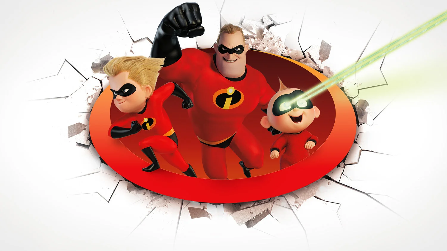
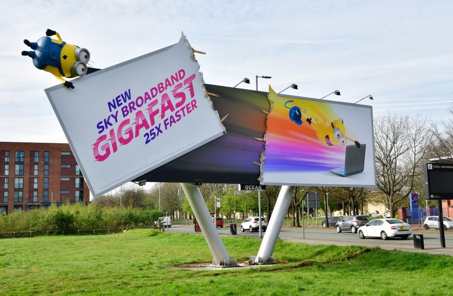
I lead the design for Sky Broadband for many years creating full 360 campaigns. I would be supplied Characters from Disney or Illumination and had the task of turning them into campaign imagery. I created, retouched and composited backgrounds, effects, holding elements, typographic treatments and a variety of assets to be used across print and digital.
These are some of the press ideas I put forward, sadly they only ran the straight versions.
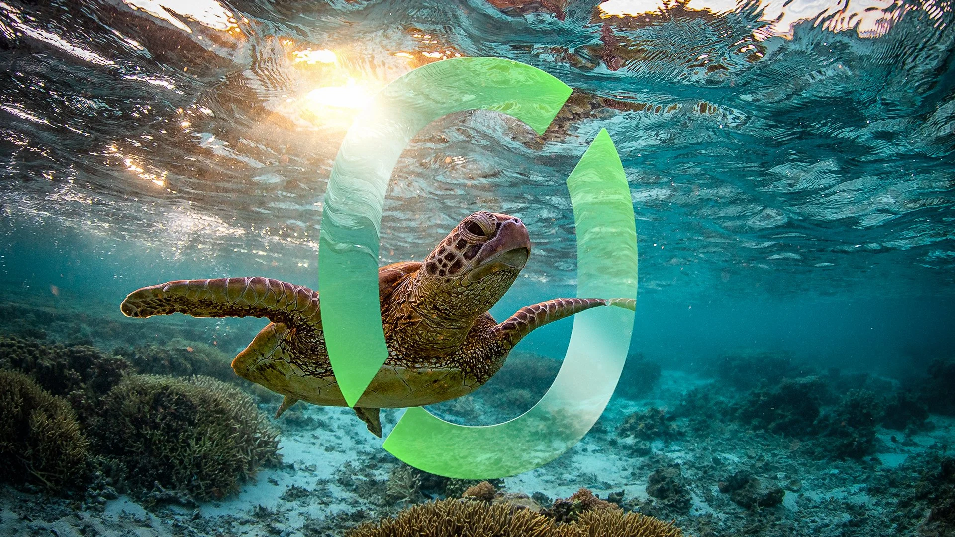
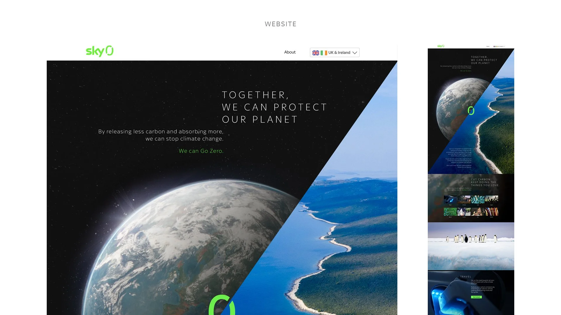
Sky Zero is Sky’s mission on being the first media company to go carbon neutral by 2030. I came up with a simple equation to illustrate the mission. It represents balance, which was the thread that tied everything together through every part of the campaign.
I lead the brand strategy of the campaign, the art-direction and design execution. Retouching beautiful imagery with a clear visual direction was great to play around with. and everything went down very well with the client.
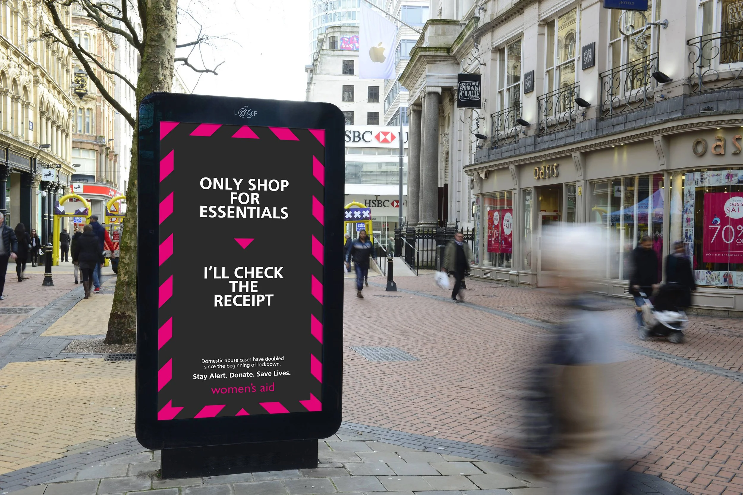
I was the long running designer for Women’s Aid tasked with visualising and executing ideas the agency came up with. The ideas had to be bold and creative to get sign off from the client, but also to sell in to companies to get free media. I always had time for this charity so I always found time to mock-up ideas, finesse imagery or get the work print ready.
This was a brand identity project for the charity Duchenne UK. The disease wastes muscle leaving them wheelchair-bound from the age of 11, they won’t live past their twenties. But the boys are anything but weak - they are mentally strong for what they have to go through. Empowering their strength was the basis of the identity.
I lead the design for the identity, photography, retouching and campaign rollout. Duchenne UK loved the work and wanted me to design their main brand logo. They then wanted new logos for their annual cycling event and to design the riders jerseys. Further down the line of the campaign we got influencers involved to spread the message on their socials.
Check out the products at https://worldsstrongestboys.duchenneuk.org/
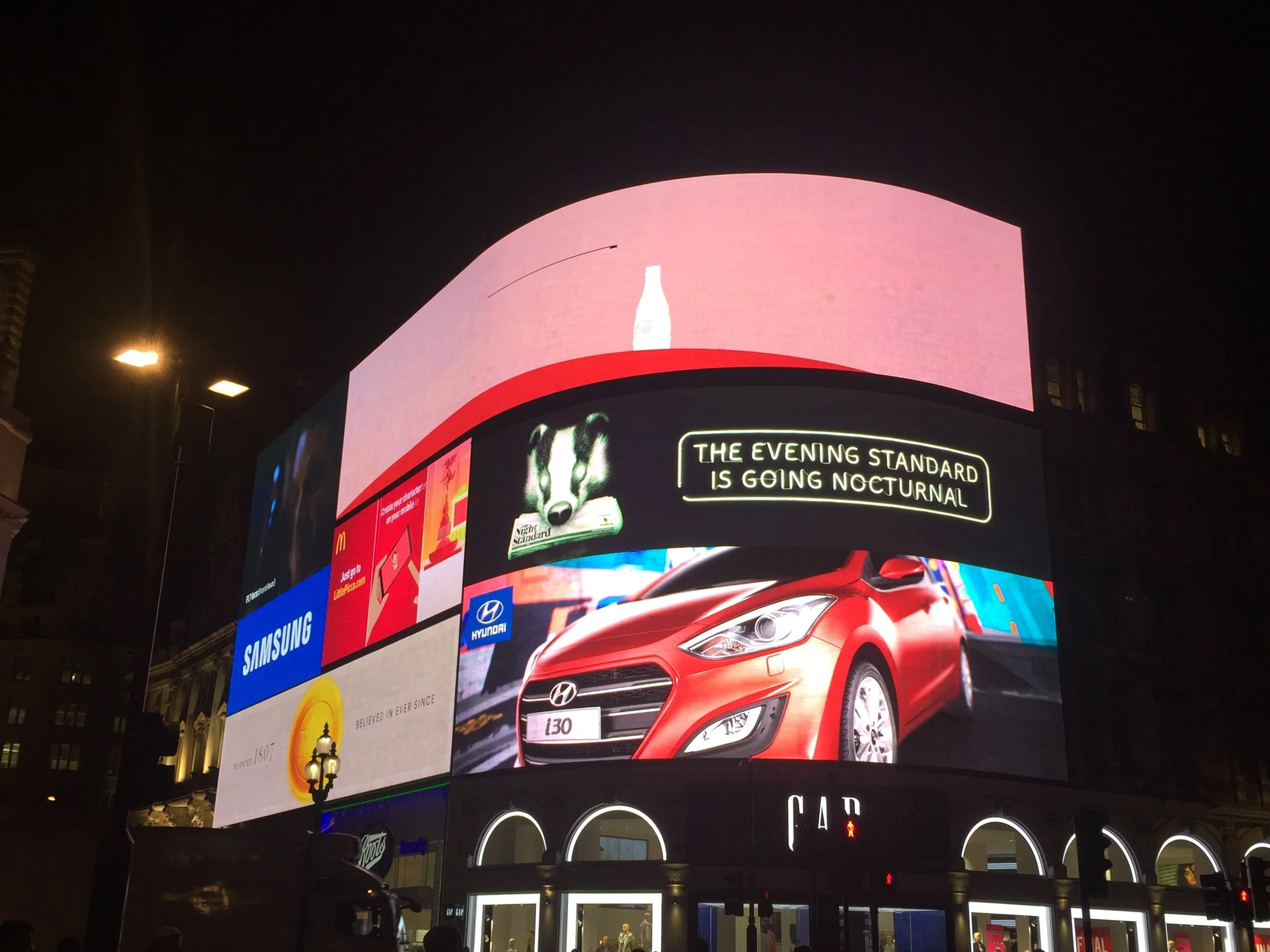
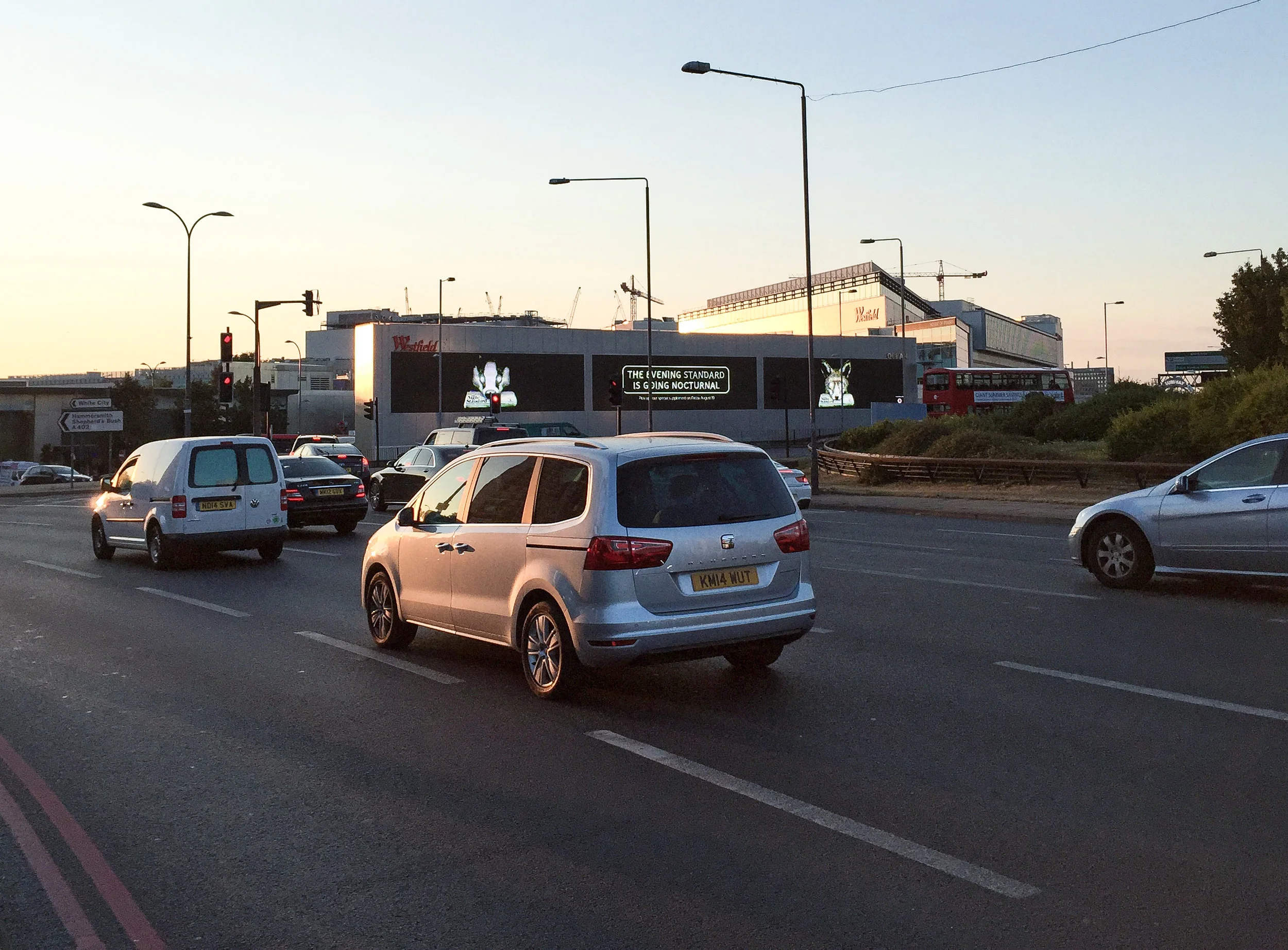
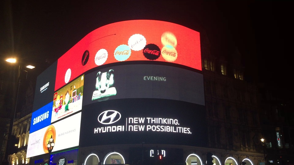
For the Evening Standard we launched the Late Night Standard, which will be distributed on the late night London tube stations. The animals were comped, retouched and artworked by me. The animals were also animated to appear on various digital billboards around London.
Piccadilly Circus animated screen
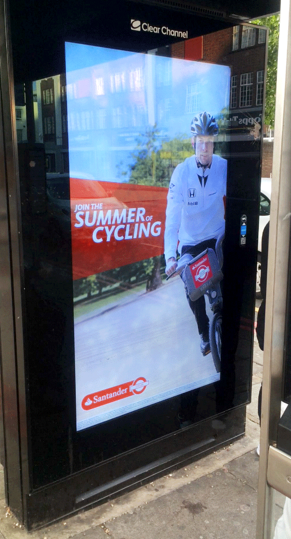
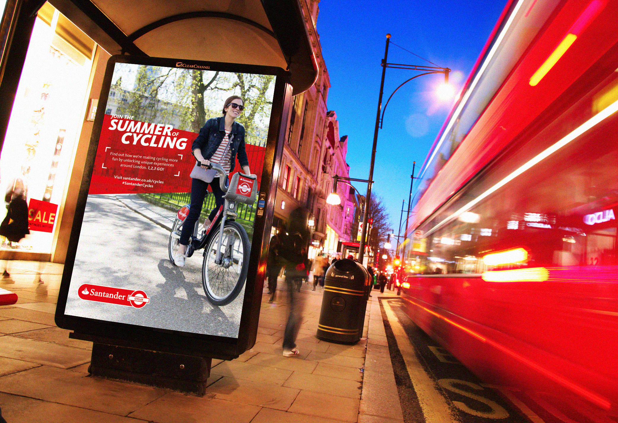
I spent 2 years leading Santander where I designed and art directed their brand campaigns in 2015 and 2016.
Here’s some alt versions of the Santander Cycles bike designs.
I then branded the Santander Cycles in Milton Keynes, taking inspiration of what’s around the area.
This was the launch campaign for Santander Cycles, which was a series of events and helpful innovative tech.
I would attend photoshoots to work with the photographer to get the stills we need for the ads.
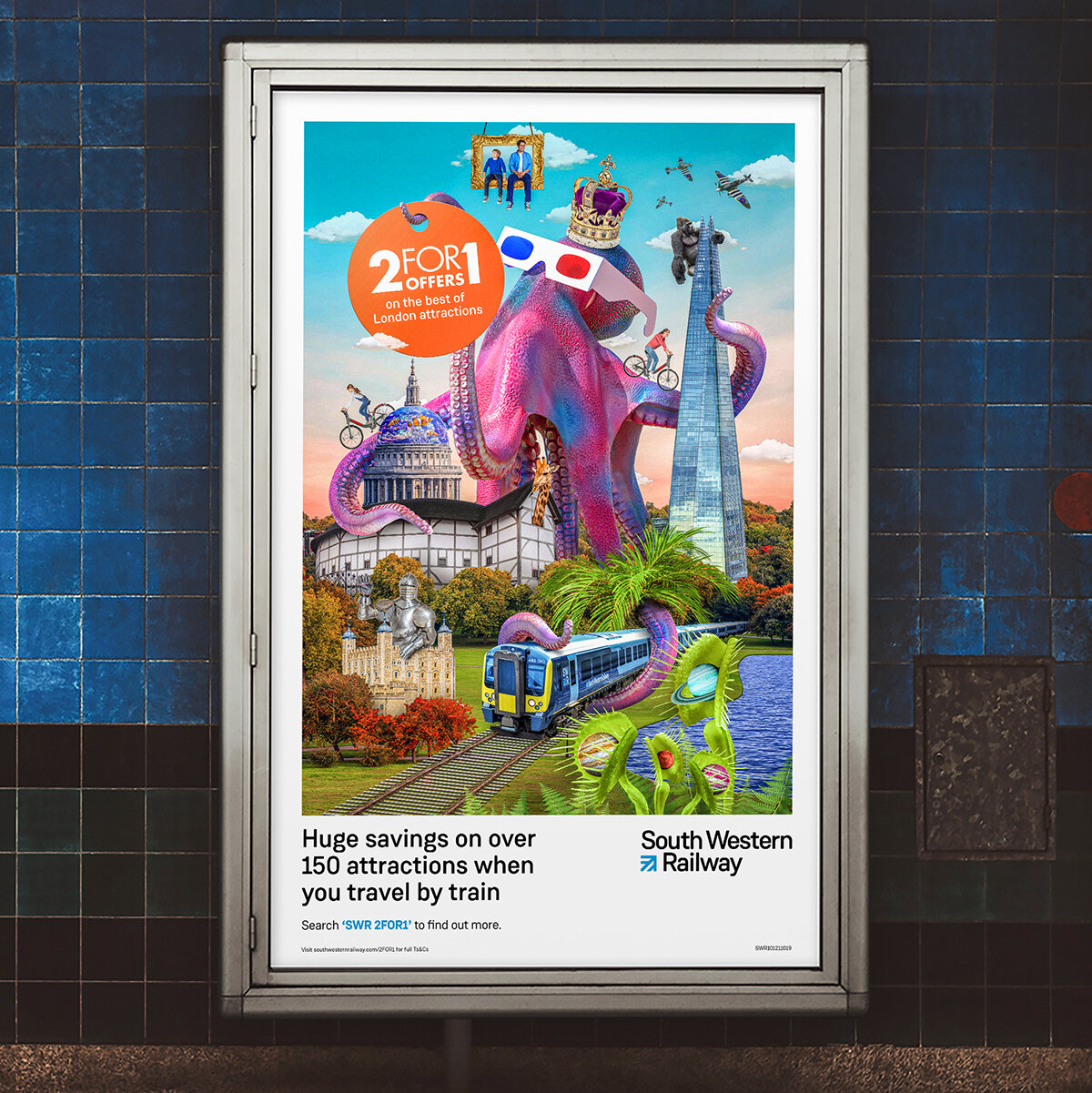
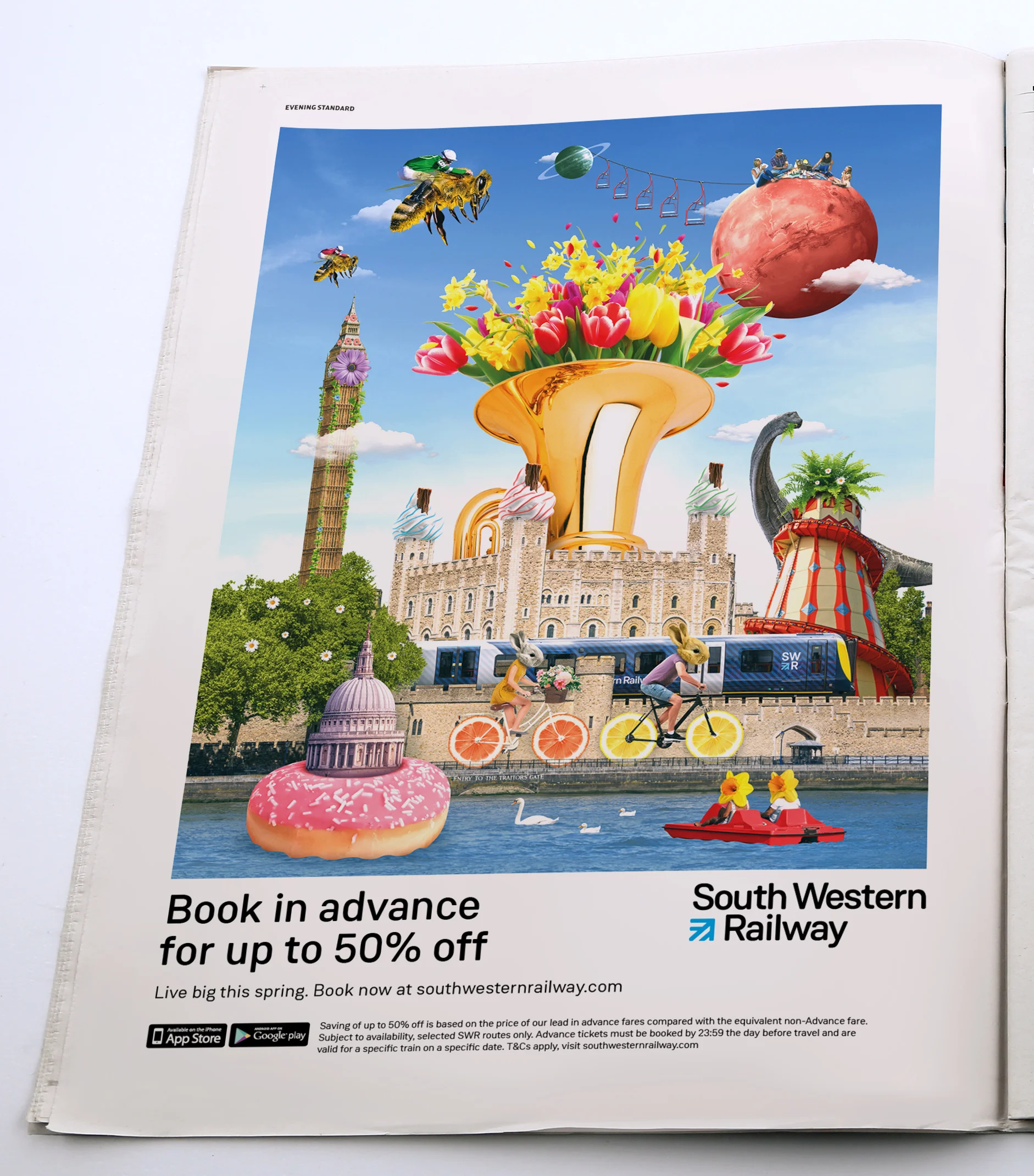
The visual direction uses collage to show attractions on SWR line. Different offers apply to certain seasons or demographics. I will create a master design in portrait and landscape then they’ll be adapted across various OOH, press and digital.
Summer 2019
1/3 off during February half term.
Black Friday Deals.
I created the look and feel for this brand focused campaign, which runs from the TV ad. A family picks up characters throughout their adventurous day out and stay with them as fond memories. I designed these three masters then rolled them out across various print and digital media.
These next two pieces are a follow on from the brand campaign highlighting the current promotion of 2 for 1 offers on London attractions.
I designed the team logos, sports interface, name cards, hunting ground map and social assets for this sobering parody video.
Watch the video here - https://youtu.be/q2BrrvM--cE
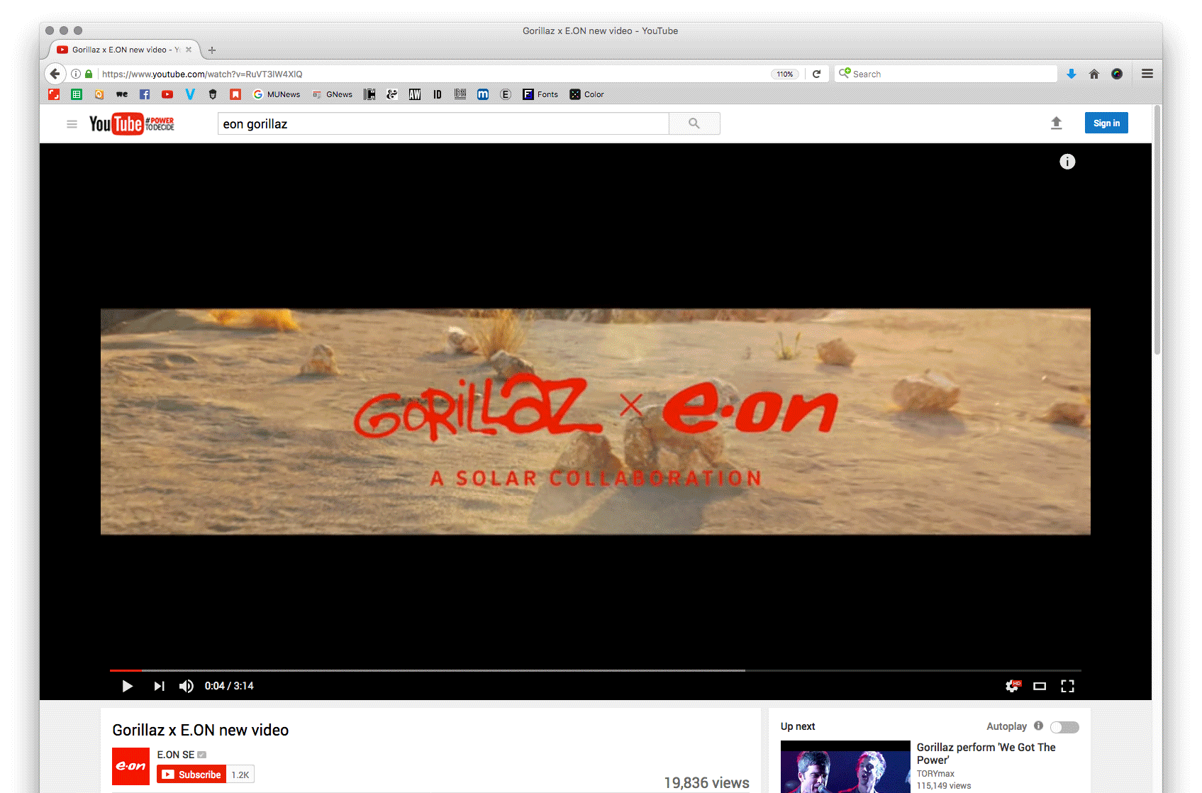
This was a branding piece to launch the latest album from Gorillaz. The band epitomises technical innovation, creativity and collaboration - We created a global campaign to promote E.ON’s solar storage technology. At the heart of the campaign was an epic music video where everything seen on screen was powered entirely by solar batteries.
Wales isn’t known for its sunshine, so it’s easy to ignore that it has UK’s highest rate of skin cancer. So, we did something that wasn’t easy to ignore – we replaced the Welsh flag. On St David’s Day we switched the Welsh dragon for a lobster. Castles, government buildings, stadiums, town halls, all had their flags hijacked, making our message ‘Don’t Be a Lobster, wear sun cream on Welsh beaches’ unmissable. The campaign went straight to Wales’ patriotic heart, reached over 40 million people and was debated in parliament. And we won a Creative Circle award for its brand identity. I worked along side designer Craig Townsend on the idea, execution and branding.
An entry for a competition to get brands to appear in tv and print ads with their brands or messages altered to represent how it may appear to someone with one of the many forms of dyslexia. This was a play on the Marines tagline ‘It’s a state of mind’. Copy, art direction and design was by me.
This was a project I worked on with a creative team (Morgan Hinds-Shorland and Tom Madden) to visualise a candle company with a twist. The wax would be made from re-used fatty deposits that block drains and sewers. I designed the logo, then constructed the sewer inspired pots in Cinema 4D.
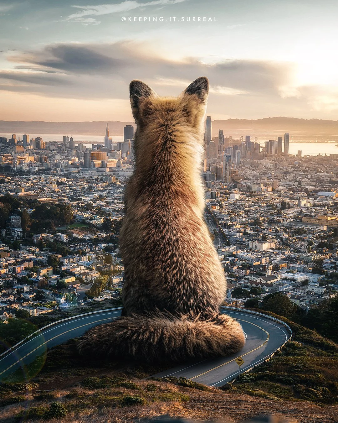
Here’s some digital art from my personal Instagram page @keeping.it.surreal